Fun
Competitive
Welcoming
Engaging
Genuine
Enabling

Console Gaming League

- Creative Direction
- Brand Development
- Marketing Strategy
- Visual Identity
- Design System
Console Gaming League is a Pro/Am tournament platform for Xbox, Playstation, and Switch users spanning across the Americas, Europe, Africa, and Oceania. What started as a small community-run Xbox Overwatch tournament in January of 2017 transitioned to a multi-title tournament host and needed a new identity to unify its titles and users. As the Creative Director for CGL at the time, I spearheaded the rebrand, soliciting feedback from various internal shareholders to ensure the CGL message resonated with the entire community. The result is a brand with broad, welcoming appeal, a competitive edge, and a flexibility to remain adaptable to CGL’s expansion into new titles and markets.
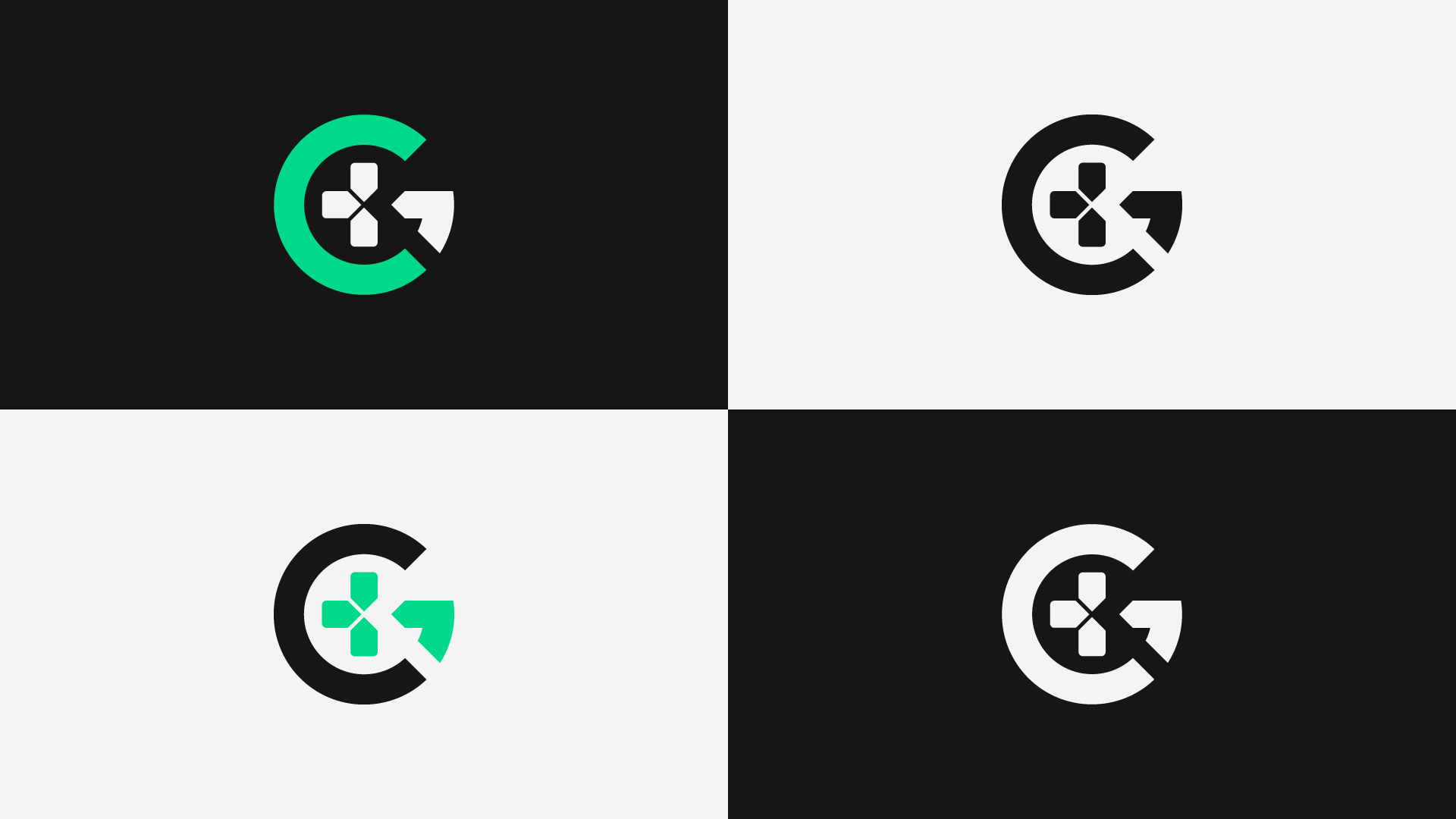
As a predominantly Xbox community expanding to include Playstation users, unity was an important element in the rebrand. CGL also needed a strong identity to remain recognizable within each gaming ecosystem. Lastly, the CGL logo needed to be iconic and connect with the community in a tangible, evergreen way. A big part of the CGL growth came from the inclusion of the Fighting Games Community, or FGC. As such an influential part of the place CGL was carving in the gaming community, it was important to make sure they were also represented in this rebrand. As we went through the Creative Brief, certain themes started to emerge and the brand voice and personality started to take shape.

Because we knew the logo would be used to represent a growing number of gaming communities, we decided the silhouette of the icon was important so the brand would be recognizable in any environment. In thinking about which elements to highlight, the d-pad was quickly identified as a similar component for both Xbox and Playstation users. Not only did it help unify the two platforms, it easily differentiated the console community from the PC gaming community. As we continued researching how to visually represent the wide range of titles and genres CGL hoped to support, the fight stick notation quietly emerged and perfectly fit with the shape of the G. This realization both gave the icon balance and incorporated the FGC, a community so integral to CGL’s growth.
With the icon established, the team started looking at color options and, after rounds of consideration, settled on an electric teal. This color was chosen because it’s a combination of green and blue--the iconic colors used by Xbox and Playstation--and because it’s an eye-catching flash of color in a digital environment. To expand the brand further, we took the button notations from both Xbox and Playstation controllers and created a geometric particle system that allowed for a lot of creativity in the execution. This particle system was used throughout the execution to create a visual cohesion across each of CGL’s communities.